Boost hospitality website conversions (more bookings and contacts)
- Your website gets visitors, but they do not call, do not book, and do not click for directions.
- Every missed click is an empty table (or an order through a commission-based platform).
- In 30 minutes you will know exactly which 5 changes will deliver the fastest results for your venue.
First: what does “conversion” mean in hospitality (and which one really matters)?
“Conversion” sounds like something for big e-commerce brands, but in hospitality it is simple: a visitor does what you want. Not “just browsing”, but taking action.
When you change something on your website, you want to avoid spending time on tweaks that do not bring in extra guests. So first: decide which actions are actually worth money for your business.
The 4 most important conversions: booking / calling / directions / ordering
For most hospitality businesses, these are the actions that matter:
- Booking (lock in a table, fewer empty seats)
- Calling (last-minute questions: “do you have space?”, “can we bring a dog?”, “can we come with 10?”)
- Clicking for directions (people who already want to come, but still need to find you)
- Ordering (takeaway or delivery: direct revenue)
Everything around that (looking at photos, reading the menu, “about us”) supports the decision. Important, but only if it ultimately leads to one of those four actions.
When to choose 1 primary goal vs multiple goals (per page)
- Homepage: usually two primary goals: Book and Call. Why? A couple planning ahead prefers booking. Someone already in the car would rather call.
- Menu page: the primary goal is often Book (restaurant) or Order (takeaway).
- Contact page: primary goals are Call and Directions.
- Campaign page (for example Christmas menu, Valentine’s, New Year’s brunch): make it one goal, like Book for Christmas.
Too many goals on one page is like a server reciting ten dishes at once: the guest loses the thread and chooses nothing.
Quick baseline check (10 minutes): where do people drop off?
Grab your phone and do this as if you are a new guest:
- Search for your venue on Google and tap your website.
- Ask yourself 3 questions within 10 seconds:
- Am I in the right place (cuisine, vibe, price range)?
- Are you open (today, right now)?
- How can I book or call now?
- Tap through to the menu: is it readable without pinching and zooming?
- Try to book: how many steps does it take?
If you get annoyed along the way, your guest will drop off.
The #1 guest journey: Google Maps -> website -> action
For hospitality, a big share of visitors does not land “neatly” via your homepage. They see you in Google Maps, read a few reviews, check photos, and only then click through to your website. That is exactly why many venues get traffic but few actions: the last step is unclear or too slow.
This is also the difference from generic conversion articles: in hospitality you often win not with long copy, but with three things that always work on mobile: clarity, speed, and one-tap access to booking, calling, or directions.
What mobile users want: “open now?”, “where?”, “can I book?”
On a phone, behavior is practical. People want to decide fast, often while on the go or while discussing options with friends.
Make these three things instantly clear at all times:
- Open today? (ideally including exceptions: holidays, late-night shopping hours, winter hours)
- Where are you? (street + city, plus a directions button)
- Can I book or call immediately? (without hunting for it)
Keep the same info consistent everywhere: hours, phone, address, menu
A common frustration: Google says “open until 11:00 PM”, your website says “kitchen until 9:00 PM”, and Facebook says “closed Tuesdays”. Then guests doubt and choose the safe option: somewhere else.
Make it easy on yourself: keep opening hours, kitchen hours, phone number, address, and your menu link consistent everywhere. And update it immediately when something changes.
Tip for peak moments (weekends/holidays): make “today” extra visible (hours + booking)
In busy periods (weekends, holidays, school breaks, and December with group dinners and Christmas menus), “today” matters even more.
Add a short block at the top of your homepage:
- Open today from...
- Kitchen until...
- Book now (button)
This prevents confusion and reduces calls that are only “are you still open?”
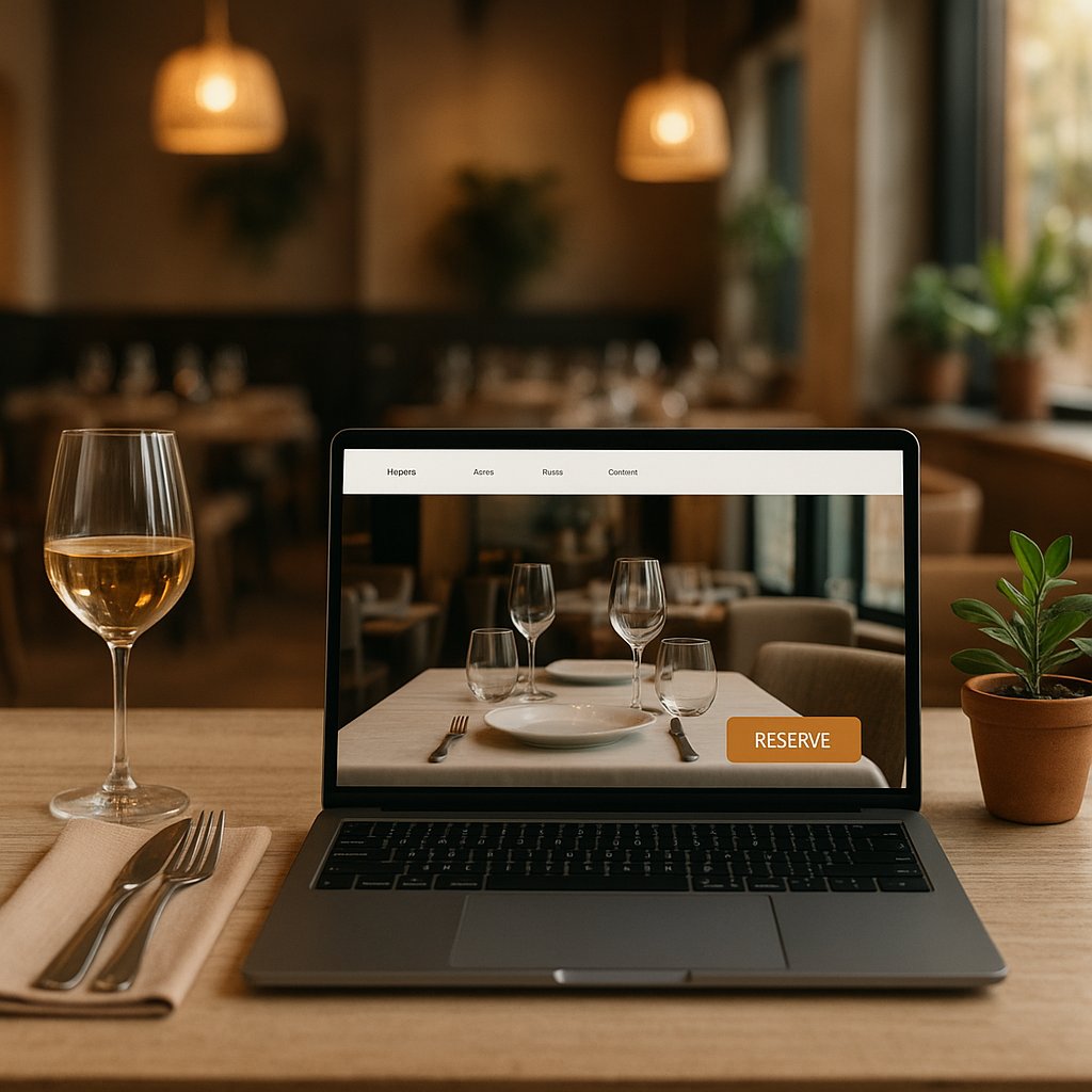
A homepage that actually converts (simple recipe)
Your homepage does not need to be “pretty”. It needs to work. In 5 seconds, someone should understand: what this place is, where it is, and what to do next.
Above the fold: 1 sentence + 1 primary button + 1 alternative (call/WhatsApp)
At the top (so without scrolling), include:
- 1 sentence that says what you are: “Spanish tapas in the heart of Utrecht, with a waterside terrace.”
- 1 clear button: “Book a table”
- 1 alternative: “Call us” or “Send a message”
Real-world example: a bar in Barcelona can do great on walk-ins, but tourists often want to quickly check if you are open and where you are. In that case, “Directions” also works well as the alternative.
Trust in 20 seconds: photos, reviews, cuisine style, price range
New guests hesitate faster than regulars. Give them quick confidence:
- Real photos of your dishes and your venue (light, atmosphere, not too dark)
- A few recent Google reviews visible on the homepage
- Cuisine style (Italian, Spanish, bistro, sushi, brasserie, pub-style)
- Price range in plain language, for example: “Main dishes usually between EUR 18 and EUR 29”
That last one can feel risky to mention, but it prevents attracting the wrong crowd (or people bouncing because they fear it is “too expensive”).
Common mistake: too many choices in the navigation
Ten top-menu buttons (“Home, About, Menu, Lunch, Dinner, Wine, Events, Gift card, Blog, Contact”) tires visitors out.
Keep it simple. For most venues, this is enough:
- Menu
- Booking
- Contact / directions
More is fine, but not if it hides the primary action.
Make booking easier (fewer steps, less doubt)
Every extra step costs bookings. Especially on mobile.
Keep the booking button visible at all times (mobile sticky)
On a phone, you want the button to stay at the bottom of the screen while someone scrolls. That way, guests do not have to scroll back up.
A simple bottom bar with:
- “Book”
- “Call”
...often outperforms a beautiful button that is invisible halfway down the page.
Two buttons that work: “Book” + “Call” (for last-minute)
Not everyone wants (or can) fill in a form.
- Book: for people who plan ahead and want certainty
- Call: for last-minute (“we are standing outside with 4”) or special questions
In many Dutch cities you see this especially on Fridays and Saturdays: people decide late. Calling saves you.
Confirmation + expectations: timing, group size, dietary needs, parking tip
When someone books, you want them thinking: “Okay, sorted.”
Add this near booking (or right after) in a short, clear way:
- How long the table is held (for example “2 hours”)
- Maximum party size online (for example “up to 8, call us for larger groups”)
- Dietary needs and allergies: how should guests share that?
- Parking tip or “station is a 7-minute walk”
This reduces mistakes, disappointment, and back-and-forth messages.
Reduce no-shows (without hassle): clear rules + reminder option
No-shows hurt. Especially for small venues.
Without making it complicated, you can already improve a lot with:
- Clear text: “Can’t make it? Please call or cancel in time.”
- A simple reminder (via your booking system or a message)
A menu that sells (not just a PDF)
Your menu is often the most visited part of your site. Yet for many venues it is exactly where people drop off.
Why PDFs often perform poorly on mobile
On a phone, a PDF is often:
- too small to read
- slow to load
- awkward to scroll
Result: people give up and do not book, because they cannot quickly see if there is something they will enjoy.
A normal web page with your dishes is much easier to read.
A “Top 6” section (bestsellers) + clear allergens/vegetarian options
You do not need to publish a perfect full menu online to get more bookings.
What works:
- Put your top 6 dishes at the top (bestsellers)
- Label clearly: vegetarian, vegan, or “can be made vegetarian”
- Keep allergens simple but clear (for example: “contains nuts”)
Real-world example: a tapas restaurant in Valencia that shows “Top 6 tapas” with clear photos and a short note (“spicy”, “gluten-free possible”) gets faster orders and bookings because choosing is easier.
Seasonal hook (logical): winter/holiday specials or a new menu goes at the top
In winter and around holidays, people mostly want to know: “Do you have something special?”
Temporarily add at the top:
- Christmas menu, year-end menu, Valentine’s menu
- game dishes, winter specials, winter cocktails
- “new menu from...”
This is also ideal for giving regulars a reason to return.
Contact and directions: make it basically impossible to get lost
People looking for contact details are often already about to walk in. Do not make it hard.
Click-to-call + WhatsApp button (with a short suggested question)
Make sure your phone number is genuinely clickable on mobile (so calling is one tap).
For messages, a button with a suggested question works very well, such as:
- “Hi, do you have space for 2 tonight at 19:30?”
- “Can you accommodate gluten-free?”
Then guests do not have to think about what to type.
Directions button + parking + public transport in 3 lines
On your contact section, include:
- Directions (one tap to navigation)
- Parking: “Parking garage X is a 3-minute walk”
- Public transport: “Station Y is an 8-minute walk”
No more needed. Three lines. Done.
Opening hours and kitchen hours separately (prevents disappointment)
A lot of frustration comes from this misunderstanding:
- The venue is open until 11:00 PM
- But the kitchen stops at 9:00 PM
Show both separately. It prevents angry guests and bad reviews.
Build trust without marketing fluff
You do not need to pretend you are “the best”. Just show you run a solid place.
Place reviews smartly (Google reviews, not “anonymous quotes”)
Use real Google reviews with name and date (preferably recent) instead of “Amazing food! - John”.
New guests see through anonymous quotes. Real reviews feel credible.
Photos that convince: atmosphere, dishes, team (no stock)
Use photos of:
- the atmosphere (terrace, bar, tables)
- 6 to 10 dishes (good light, real portions)
- your team (a smile behind the bar, the chef in the kitchen)
No generic stock photos. People want to see where they are going.
FAQs on your page (kids/dogs, dietary needs, groups)
Add a small “Frequently asked questions” block on your contact or booking page, for example:
- Are children welcome?
- Are dogs allowed?
- Do you have a high chair?
- Can we come as a group?
- Can you accommodate allergies?
This removes doubt without generating extra calls.
Speed and mobile (people do not wait)
If your website is slow, you lose actions. It is that simple.
3 quick checks: load time, buttons big enough, text readable
Check this on your own phone (not on office Wi‑Fi, but on your normal connection):
- Does the page load within a few seconds?
- Can you tap buttons easily without mis-taps?
- Is the text readable without zooming?
If any of those is “no”, it is costing you bookings.
Resize images (most impact, least effort)
The biggest gains almost always come from photos that are far too heavy.
Resize images before they go on the site. You keep quality, but loading becomes much faster. This is one of those changes you often feel immediately in more clicks.
Fewer pop-ups and banner clutter on mobile
On mobile, a pop-up is usually just annoying. Especially when someone only wants to quickly view your menu or book.
If you want to highlight something (like a Christmas menu), use a clear top bar or a homepage block instead of blocking the screen.
Measure results without complicated tools (simple and practical)
You do not need complex systems to see whether it works. You only want to know: are you getting more actions?
What you should measure at minimum: booking clicks, call clicks, direction clicks
Track three things:
- How many people click Book
- How many people click Call
- How many people click Directions
If you cannot see that automatically, start simple: for one week, note how many bookings and calls come in via the website (ask your team to tally it if needed).
Use a simple week-to-week comparison: before/after (one change at a time)
Do it like this:
- Week 1: change nothing, only measure
- Week 2: one change (for example keep the booking button visible)
- Week 3: next change
If you change five things at once, you will not know what caused the result.
When you should bring in help (if you are unsure or things drop)
Get help if:
- you make changes and bookings suddenly drop
- your website regularly behaves “weird” on mobile
- you do not know where to start and do not want to waste time
It is often faster and cheaper to get it set up properly in one go.
Frequently asked questions / objections
“Won’t this cost a lot of money?”
Many improvements mostly cost attention, not a big budget: buttons, copy, order, making the menu readable. Only when you need to truly fix booking flow, speed, or site structure does it become more work.
“Do I have time for this alongside running the place?”
You do not have to do everything at once. Pick 5 quick points and tackle one each week. Many items take 30 to 60 minutes, especially when you know exactly what to change.
“I’m not good with tech, can I still do this?”
Yes, because most of it is not technical but clarity: which button, which info, which photos, which order. And if something does get technical (like performance or a fixed bottom button), you can outsource it.
“Does this still work if I already have a booking system?”
Even more so. The problem is often not the system, but the path to it: the button is not visible, too many steps, unclear expectations. Small changes help you get more from what you already have.
“How do I know for sure it will pay off?”
You never get certainty, but you can prove it in a very practical way: measure one week, change one thing, measure another week. If booking clicks, call clicks, or direction clicks go up, you know it is working.
Quick action: your 5 quick wins (choose based on venue type)
Below are fast choices per venue type. Pick five, no more. That keeps it realistic.
Restaurant (booking-first)
- Put one big button at the top: Book
- Add a second button: Call (for last-minute)
- Put “Open today + kitchen until” at the top (especially on weekends and around holidays)
- Make your menu page readable on mobile (no unreadable PDF)
- Show 3 to 5 recent Google reviews on the homepage
Takeaway/delivery (ordering-first)
- Put at the top: Order now (and make that button visible everywhere on mobile)
- Show your “Top 6” bestsellers with clear prices
- Make delivery and pickup times crystal clear (today)
- Make contact ridiculously easy for mistakes (“missing something?”) with one call button
- Always include your address and directions (people also pick up)
Bar/cafe (call/directions + events)
- Put at the top: Directions + Call
- Make opening hours and any live music or events instantly visible
- Add 6 to 10 atmosphere photos that truly show your place (no dark, blurry images)
- Add a short “what kind of bar are we?” sentence (craft beer, cocktails, sports, tapas)
- Create a simple agenda section: “This week”
Checklist (printable): tick off 10 points
- At the top on mobile: 1 sentence that says what you are + where you are
- Clear primary button: Book / Order (whatever matters most for you)
- Secondary button: Call or send a message
- Opening hours and kitchen hours are correct everywhere
- Address and directions in one click
- Menu is readable on mobile (no fiddling)
- Top 6 dishes or bestsellers are at the top
- Reviews are real and recent (preferably Google)
- Photos are from your venue and load fast
- No annoying pop-ups blocking booking or menu reading
Book a free 30-minute consultation: we will review your website (on mobile) and your Google profile journey together and pick the 5 fastest conversion wins for booking/calls/directions. After that you get a short action plan (what you can do yourself + what I can fix). Request it here: hospitality website consultation.